Take 5 Jazz Lounge Logo Design
CLIENT: Princess Cruises
ROLE: Lead Designer – Concept to Completion
THE BRIEF: Princess Cruises tasked me with designing a new logo for Take 5, their signature jazz lounge onboard the Sky and Enchanted Princess ships. The goal was to evolve the existing logo to better reflect Take 5’s identity as an immersive Jazz Theater experience, celebrating the history, storytelling, and vibrancy of jazz music within a sophisticated yet welcoming lounge atmosphere. The logo needed to embody this rich cultural narrative while feeling elegant, contemporary, and versatile for use across venue signage, digital displays, marketing collateral, and bar menus.
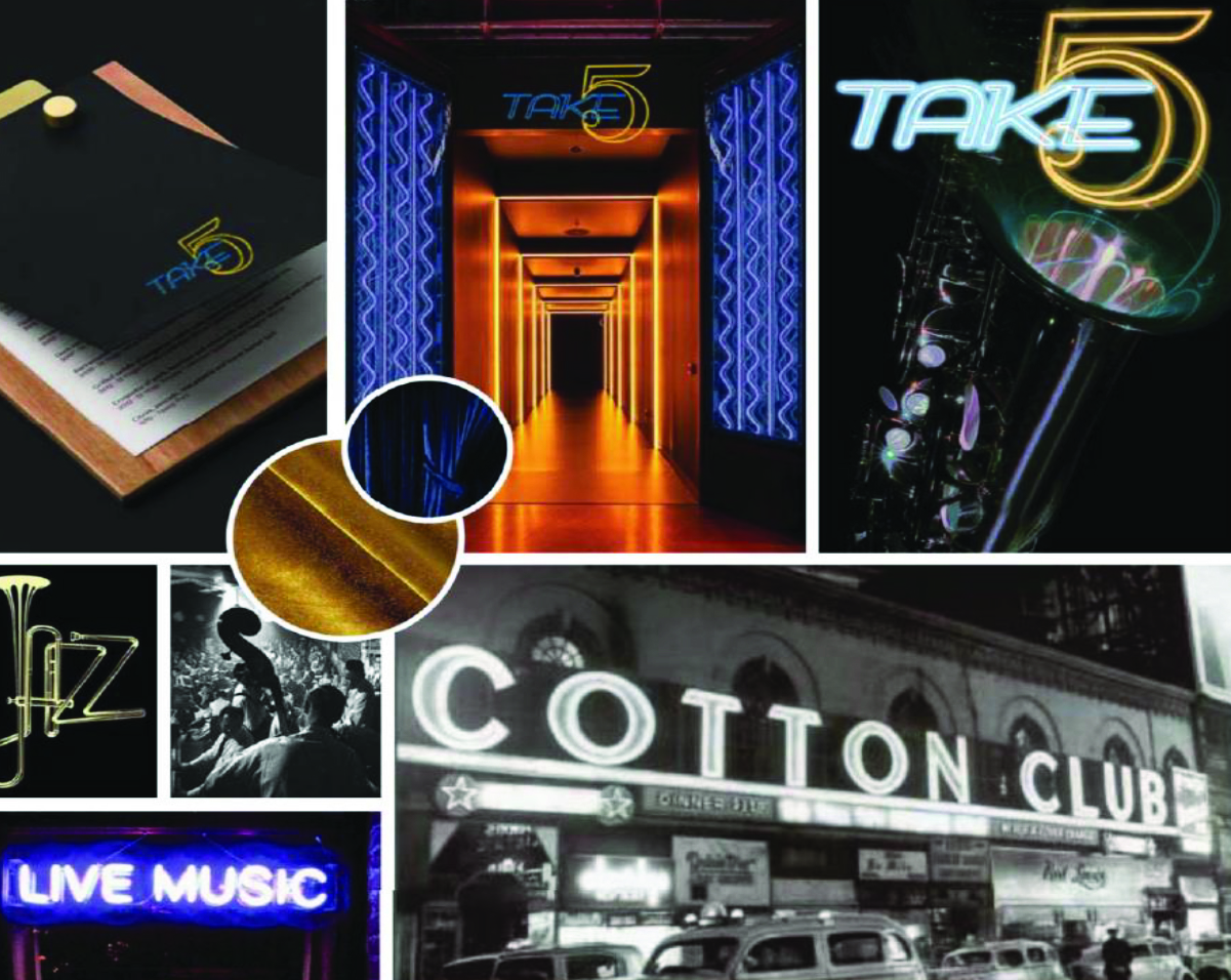
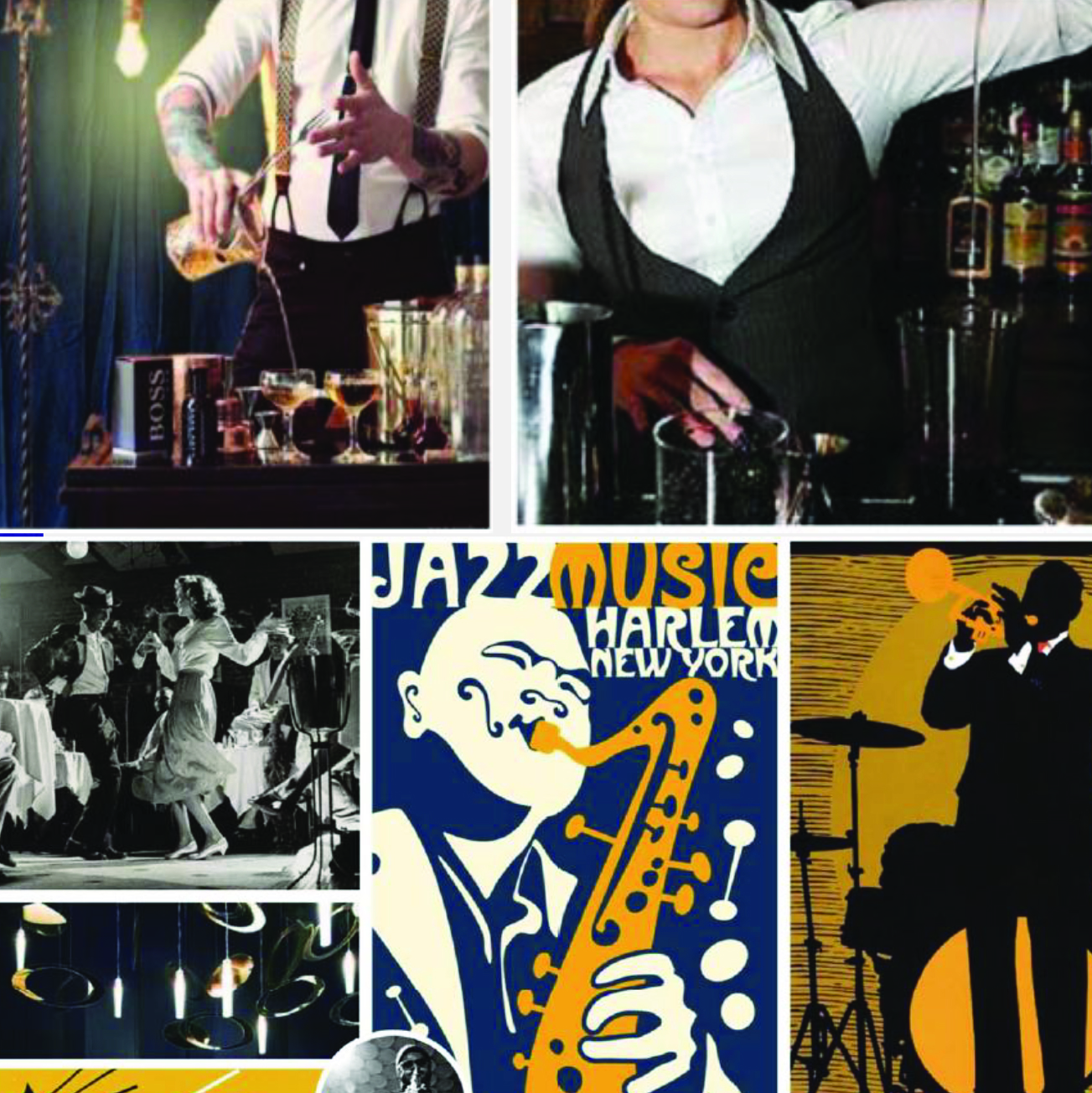
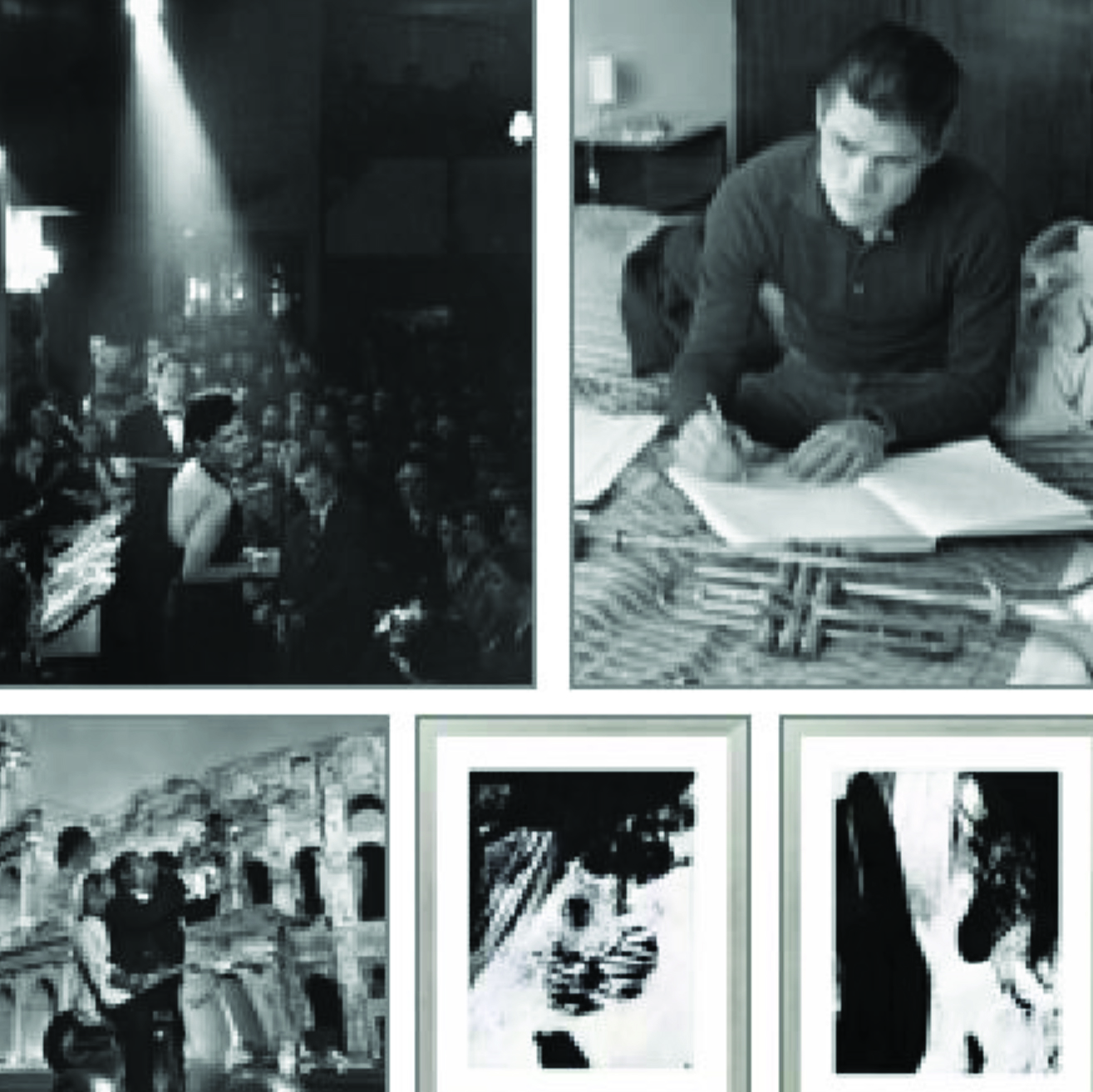
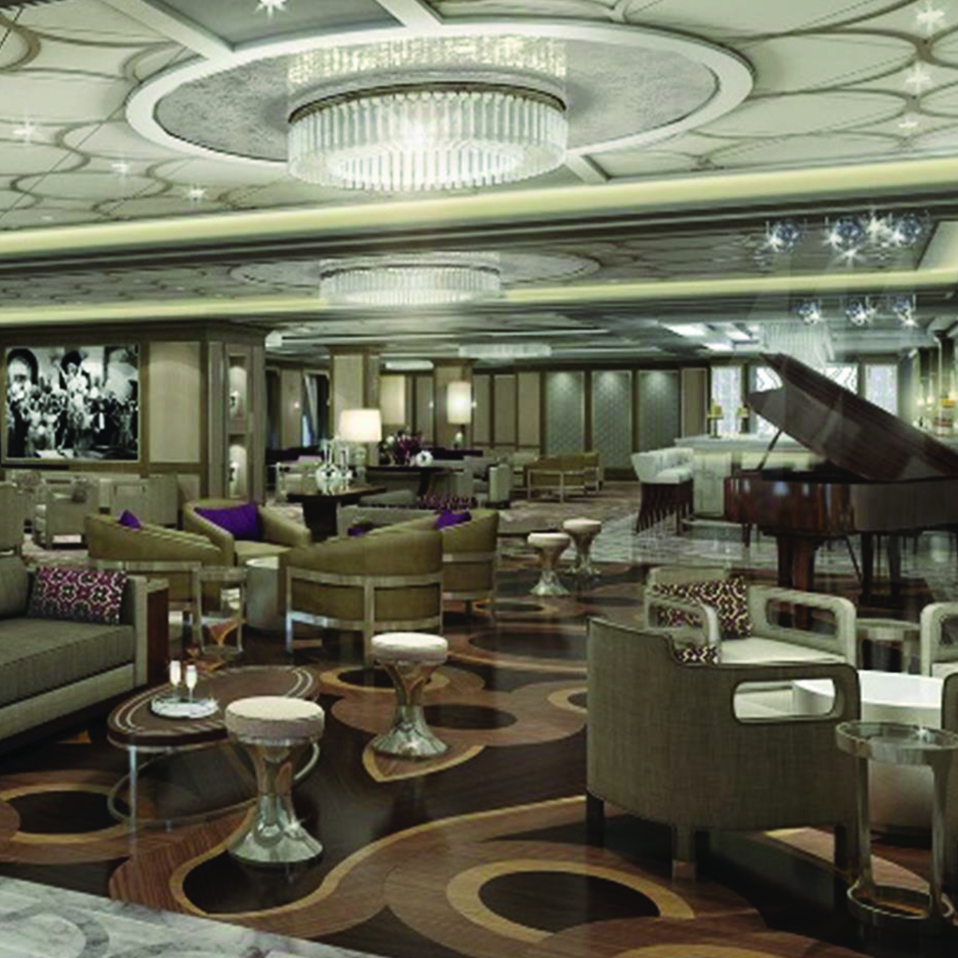
Venue Inspiration & Visual References
To inform the design direction for the Take 5 Jazz Lounge logo, I reviewed a series of reference images provided in the project brief. These visuals captured the essence of jazz culture, historic venues, vibrant performances, and the sophisticated ambiance envisioned for the lounge. This inspiration guided my approach to integrating musical motifs, elegant typography, and a bold color palette that reflects the rich storytelling and immersive experience of Take 5 onboard Princess Cruises.
Creative Direction / Constraints
I was given creative freedom with the design, with the requirement that it lean into the era, storytelling, and cultural background of jazz as outlined in the venue inspiration deck and creative brief. Although this concept was not the final direction selected, it represented my strongest creative perspective for the project.
The Process
I approached this logo design by first researching the era of jazz that inspired the venue concept, exploring the atmosphere, storytelling themes, and musical heritage described in the venue inspiration deck and creative brief. My goal was to reflect the bold, sophisticated, and culturally rich ambiance of jazz lounges through visual elements that feel both timeless and vibrant.
Using Adobe Illustrator, I developed concepts that incorporated:
Using Adobe Illustrator, I developed concepts that incorporated:
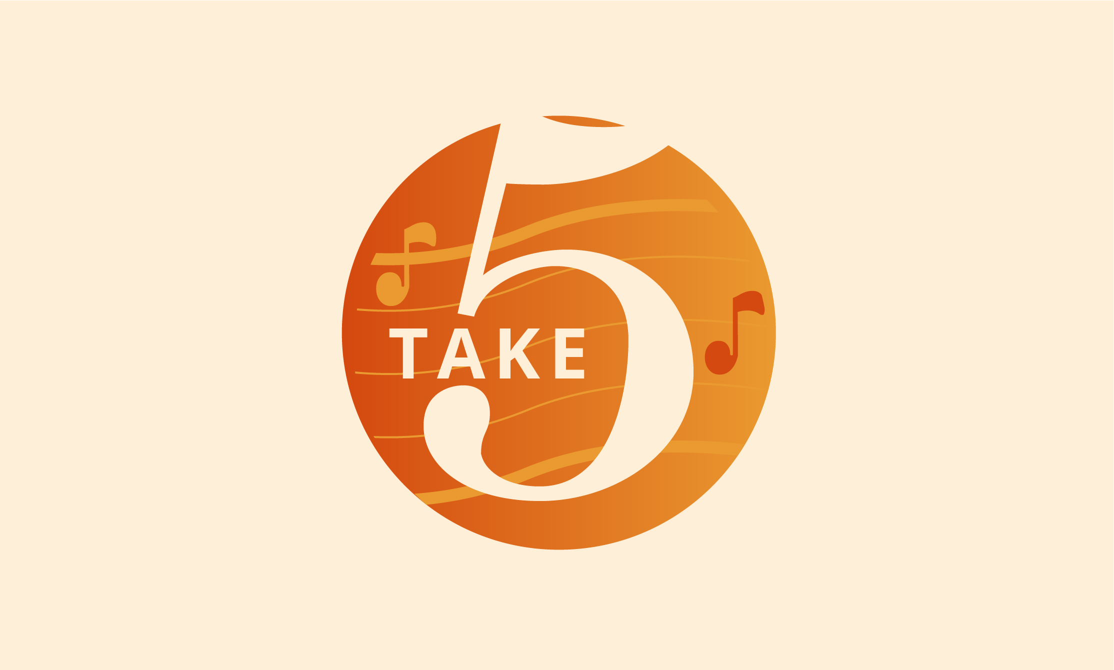
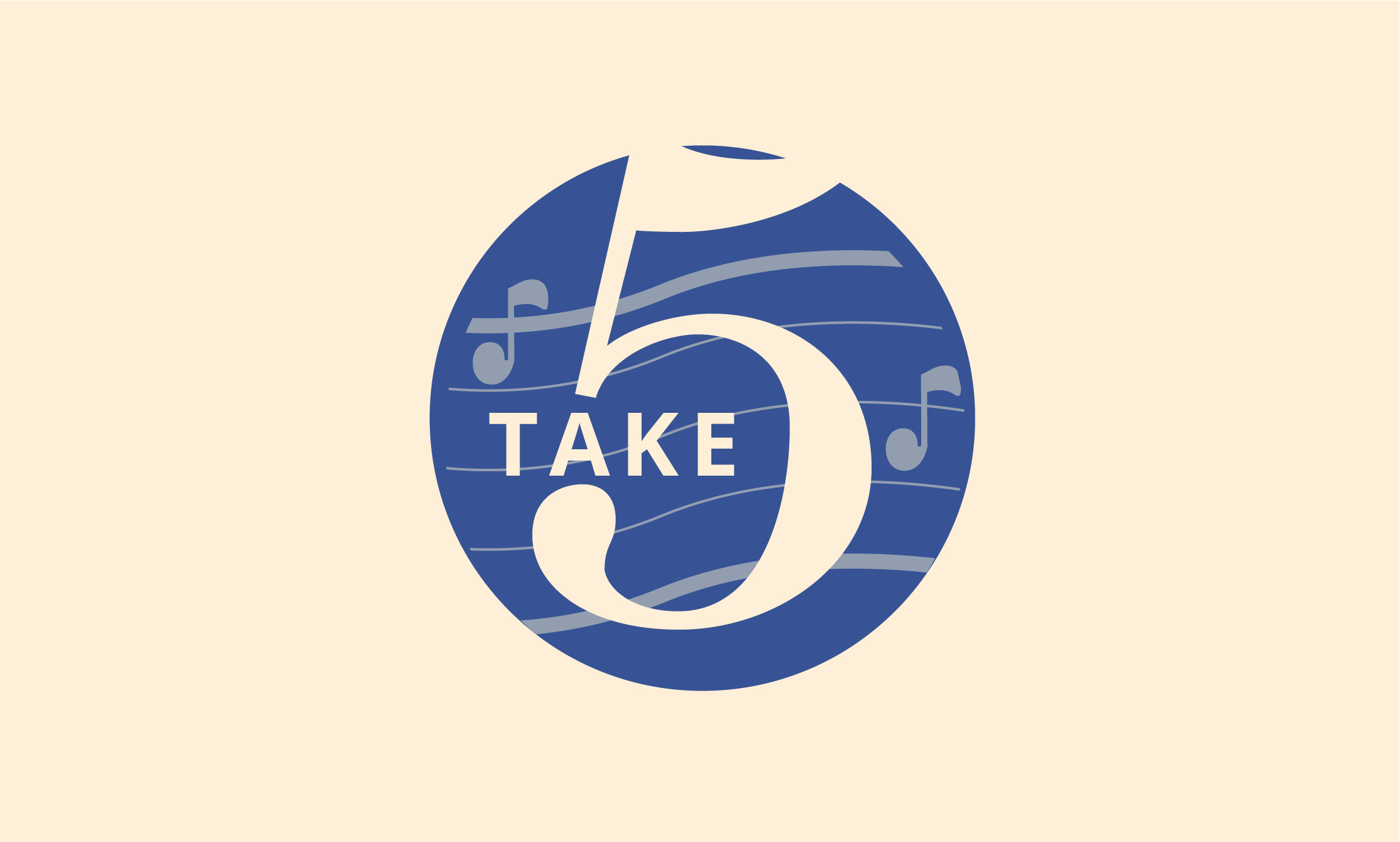
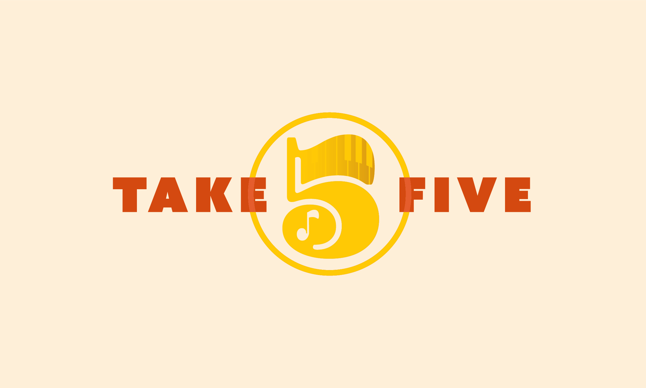
- A stylized “5” with integrated piano keys, evoking the music central to the lounge experience.
- A musical note within the tail of the “5”, inspired by stakeholder feedback suggesting this integration.
- A warm gradient color palette of oranges, reminiscent of classic jazz club lighting, wood tones, and sunset hues that align with the intimate yet energetic vibe of jazz performances.
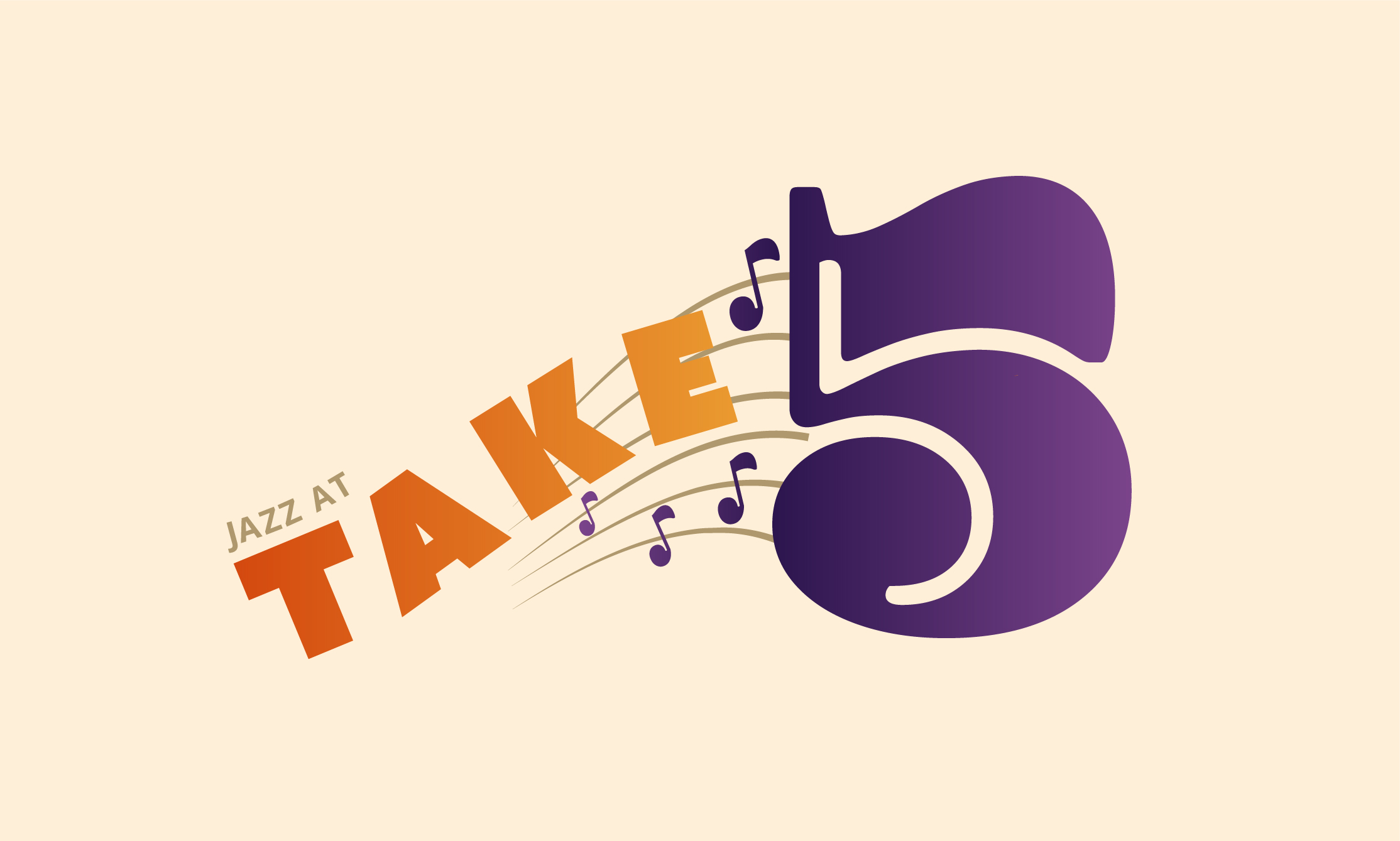
- Bold, geometric typography for “Take” and “Five” in deep purple, grounding the logo with a sense of confidence and presence.
Concept Explorations
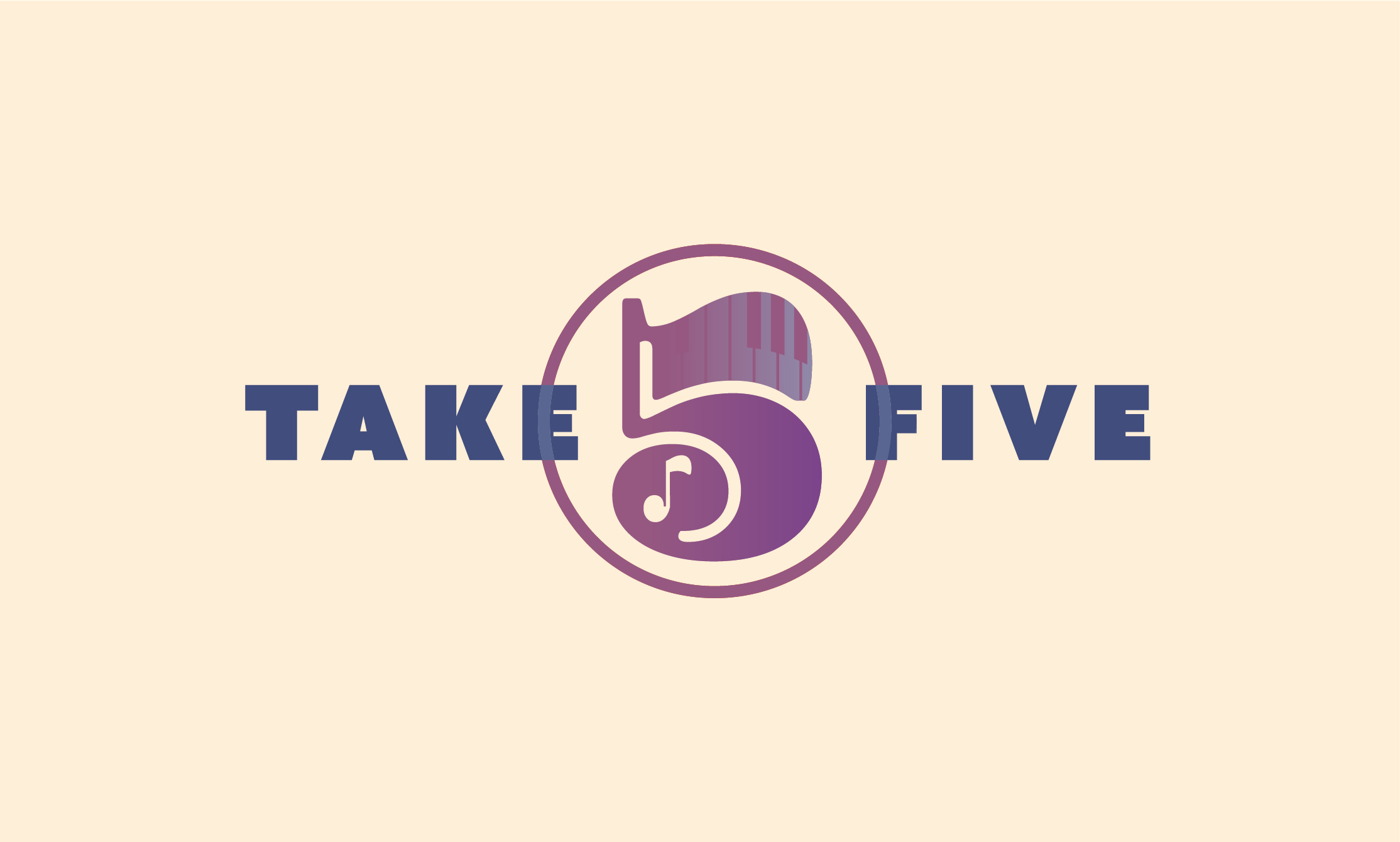
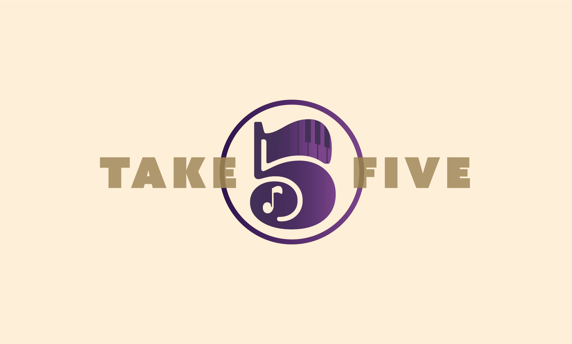
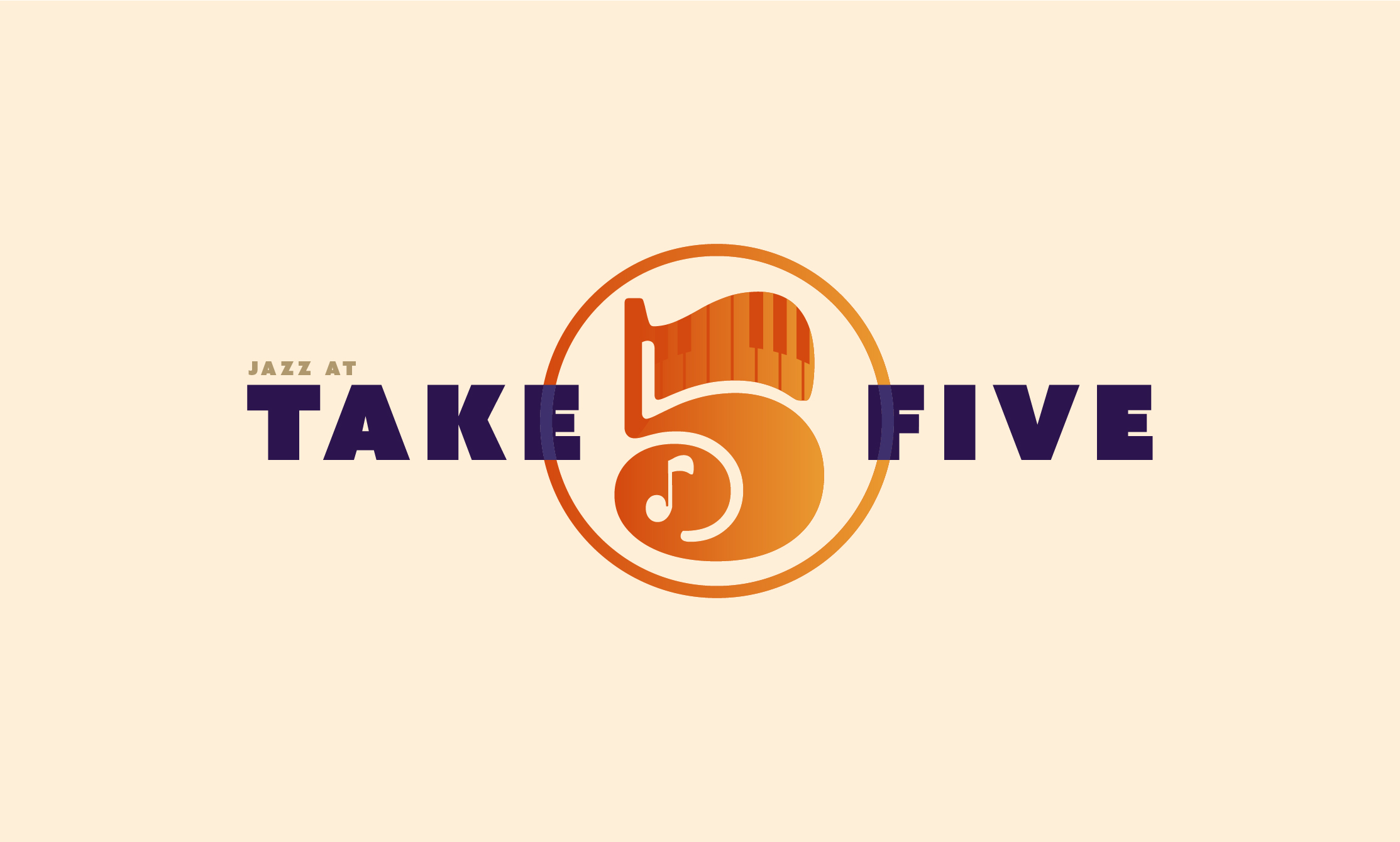
Throughout the design process, I developed a range of logo concepts exploring different ways to integrate the number “5” with the wordmark, testing variations that incorporated musical elements, bold typography, and balanced compositions. Some concepts leaned into simplified graphic approaches, while others explored symmetry with a full “TAKE 5” lockup. Each exploration aimed to capture the sophisticated, vibrant atmosphere of a jazz lounge while ensuring clarity and versatility across digital, print, and large-scale venue applications. This process allowed me to refine and select the concept direction showcased in this case study as the strongest creative solution aligned with the brand’s vision.


The work
programs used


